A StackPanel works great as far as stretching in one direction (opposite the orientation): it behaves just like a Star sized Grid with one row or column. The problem happens in the direction of the StackPanel’s Orientation, where it behaves as an infinitely sized container. This results in the StackPanel passing an available width or height of Infinity to each of its children, which for some types of elements can make it difficult to size properly. This can be easy to diagnose for direct children of the StackPanel and is often easy to fix. Unfortunately the problem is inherited by any child contained anywhere under the StackPanel and can become significantly harder to debug.
StackPanel children
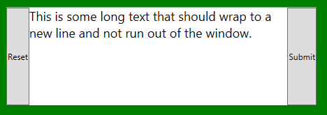
In the case of direct children the fix can be straightforward but depends on the desired final layout. Let’s start with a simple example of a Horizontal StackPanel containing a TextBlock. In this case the text is too long to fit in the available space but even though TextWrapping is set to Wrap it stays on a single line and runs off the screen.
<pre class="brush: xml; highlight: [5, 15]; html-script: true"><StackPanel Orientation="Horizontal">
	<Button Content="Reset"/>
	<TextBlock TextWrapping="Wrap" FontSize="18">
		This is some long text that should wrap to a new line and not run out of the window.
	</TextBlock>
	<Button Content="Submit"/>
</StackPanel>

Another problem in this situation is that anything after the TextBlock in the StackPanel will get pushed off the screen too. In a lot of cases the fix is as simple as swapping in a DockPanel which behaves a lot like a horizontal StackPanel but provides a correct available size in both directions.
<DockPanel>
	<Button Content="Reset"/>
	<Button DockPanel.Dock="Right" Content="Submit"/>
	<TextBlock TextWrapping="Wrap" FontSize="18">
		This is some long text that should wrap to a new line and not run out of the window.
	</TextBlock>
</DockPanel>

In the TextBlock case you would also want to make sure that the TextBlock is the last element in the list, with others using appropriate DockPanel.Dock settings, because although it will wrap when constrained, it will still eat up all of the width it can get, leaving no space for remaining elements.
ItemsControls
A special case with direct children is an ItemsControl, which by default uses a vertical StackPanel.
<ItemsControl>
	<ItemsControl.ItemsPanel>
		<ItemsPanelTemplate>
			<StackPanel Orientation="Horizontal"/>
		</ItemsPanelTemplate>
	</ItemsControl.ItemsPanel>
	<TextBlock TextWrapping="Wrap" FontSize="18" VerticalAlignment="Center">
		1. This text should wrap
	</TextBlock>
	<TextBlock TextWrapping="Wrap" FontSize="16" VerticalAlignment="Center">
		2. This text should wrap
	</TextBlock>
	<TextBlock TextWrapping="Wrap" FontSize="14" VerticalAlignment="Center">
		3. This text should wrap
	</TextBlock>
	<TextBlock TextWrapping="Wrap" FontSize="12" VerticalAlignment="Center">
		4. This text should wrap
	</TextBlock>
</ItemsControl>

In this situation your choices for alternate layouts can be limited because a key attribute of the StackPanel is that is can take any number of child elements and lay them out consistently with no additional settings on the children.
A DockPanel will work this way in the horizontal orientation because the default value for DockPanel.Dock is Left, but other types of layouts, like anything in a Grid, need a lot of extra work to get things laid out properly. The UniformGrid can be helpful for some layouts because it exhibits similar automatic layout behavior as seen with StackPanel but also constrains the sizes of children, although each child is given an equal amount of space rather than stacking.
<ItemsControl>
	<ItemsControl.ItemsPanel>
		<ItemsPanelTemplate>
			<UniformGrid Rows="1"/>
		</ItemsPanelTemplate>
	</ItemsControl.ItemsPanel>
	<TextBlock TextWrapping="Wrap" FontSize="18" VerticalAlignment="Center">
		1. This text should wrap
	</TextBlock>
	<TextBlock TextWrapping="Wrap" FontSize="16" VerticalAlignment="Center">
		2. This text should wrap
	</TextBlock>
	<TextBlock TextWrapping="Wrap" FontSize="14" VerticalAlignment="Center">
		3. This text should wrap
	</TextBlock>
	<TextBlock TextWrapping="Wrap" FontSize="12" VerticalAlignment="Center">
		4. This text should wrap
	</TextBlock>
</ItemsControl>

Nested children
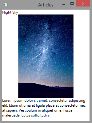
With deeply nested children the fixes can often be similar but the main problem is usually identifying the source of the issue. It’s not quite as easy as simply walking the Visual Tree to find the nearest StackPanel since the behavior is orientation specific and in some cases could be caused by other types of elements like ScrollViewer or Canvas. One fix that can help with nested sizing is to set a fixed or maximum size somewhere under the StackPanel that will override the Infinite available size value that is at the root of the problem and stop it from propagating to the remaining children.


<ItemsControl ItemsSource="{Binding Articles}">
	<ItemsControl.ItemTemplate>
		<DataTemplate>
			<Grid MaxHeight="350">
				<Grid.RowDefinitions>
					<RowDefinition Height="Auto"/>
					<RowDefinition Height="*"/>
					<RowDefinition Height="Auto"/>
				</Grid.RowDefinitions>

				<TextBlock Text="{Binding Title}"/>
				<Image Grid.Row="1" Source="{Binding ImagePath}" StretchDirection="DownOnly" HorizontalAlignment="Center"/>
				<TextBlock Grid.Row="2" TextWrapping="Wrap" Text="{Binding Text}"/>
			</Grid>
		</DataTemplate>
	</ItemsControl.ItemTemplate>
</ItemsControl>